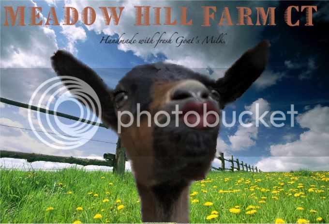
New Labels - what do you think?

Soapmaking Forum

Help Support Soapmaking Forum:

This site may earn a commission from merchant affiliate links, including eBay, Amazon, and others.
Okay... please take this as constructive criticism which is what I believe you're seeking. I think you know from my email that I really like your soaps. I would like the front of the label better if the black border wasn't there (my preference) or if the border seemed more even. Does that make sense? I really think you could do away with all borders on the front of the label and perhaps make the writing bolder. Or, if there was one big box around all the writing on the front that would seem more like a label.

Love the picture of the goat! Like the back. If you're comfortable with your address being "out there" that's your call. I realize it's a farm and you want to foster the image of the farm and the goats. However, I think for the preview on the web, I would black out or "fuzzy" the address.
 
I know that different people feel differently about this but the first thing that jumped out at me was the "Saponified xxx oils". My feeling is that it's better to just include Sodium Hydroxide as an ingredient and be prepared to explain why that's ok if necessary... The other way just feels misleading. But it's a personal choice. I'm also not sure what exactly vegetable oil is.

I would also have to agree about omitting or obscuring the home address.
 
I agree with both of the above posts. Less lines in general, the lines on the back make it seem cluttered with too much info. More white space is better. I would also prefer to see the ingredients listed as xyxoxy suggested and for the same reason. It's a great start though and way better than my first sad attempts. Cute goat pics sell!
 
The pic is cute!

The back could be simplified by adding just your website. Once people visit the site, you can have badges attached for facebook and etsy (?) and your blog, and you will also have your contact details on there too.
If you are selling from your site that would be the first place I would want my customers to visit.
 
Thank you all for the critique. Just what I wanted. I will rework the lines...

My little girl Bella is the model- was our first goat (has since past) and she remains in our heart because she was so precious...
 
Love the pic, but don't really love the lines.... I think it makes the back look too complicated, and isn't kind on the eyes. Just my opinion though :)
 
Love the picture of Bella. Your label looks good but less lines would improve it a bit IMO :wink:
 
How great to think about Bella to put on your label. She must have been very special to you!
Apart from that, agree a bit with the other postings, keep on trying, the perfect label is on his way...
 
Coming from a non-native english speaker, the wording is a bit off. It doesn't say saponified oils, but saponified vegetable :)
Saying the soap contains sodium hydroxide would be a ... lye :p

However, I have heard other soapers that feel it would be misleading not to include that. I am not sure if the average customer feels the same.

All things considered, maybe this would be a step forward:

Vegetable oils (Coconut and Rice Bran, saponified using Sodium Hydroxide)

or, since the word vegetable seems a bit redundant:

Coconut and Rice Bran oils (saponified using Sodium Hydroxide)


------------

I agree that the back side looks very cluttered. Maybe the website is enough, and you have there links to the blog and shop.

And the owner and address can be on the same line

The lines between the rows are also too heavy. Maybe a thin gray line (or another more lighter colour from your graphical composition).

--------------------------

The goat is sexy, but the printed picture looks poor quality. Also, frame is to thick.
 
cigar brands used to be the bane of my existence - you need to line them up exactly or they look sloppy. IMO.

If this isn't the kind of feedback you are looking for then please forgive me. I'm trying to be constructive, not critical.

legally, at least in NJ, your physical address MUST be on a soap label. not to say everyone does this - but it is what you should do. i'd NOT put YOUR name on the label though, unless you are doing something like Lush does (handmade by Ruth O, tho that makes you sound like an employee as opposed to the one and only)

i don't know if you just are showing me what is PRINTED or if we are critiquing the whole shebang, but it looks like the edges are not evenly cut. use a paper cutter if you are using this sort of label.

and the name MeadowHillsFarmCT - I like it for a forum name, but it's difficult to read if you are just browsing products. Adding a space between the words would probably work better...

regarding the ingredient list. I know people have their own standards and all, but "saponified oils" is not accurate. NOT all the oils have been saponified (lye discount) and there are other components that is the result of saponification (think glycerin). More accurate, and correct, to list your ingredients - you know, what you put in! but again, not to say everyone does this - but... (what the average customer would think isn't relevant - it is what is the best practice and the law)

Love the little goat pic. BUT, with the lavender in the background (which does look lovely) you may be communicating "lavender". Lavender visual + tropical name is a bit of a disconnect.

If you can get to the blog, etsy, and your email through the web site, perhaps you want to list only that (or only list etsy & blog?). It seems too many choices to me.
 
Thank you all :)

I am not offended in any way by the criticism..

I am going to rework them this weekend and take all the feedback into account.

Bella was my little girl - would sit on my lap whenever I was out in the yard and let her out to roam with me while gardening. She had the sweetest little 'blahh' and you would hear it over all the loud mouths out there. We were very sad when we lost her (she was only 1 yr old). It was upsetting and tragic... I will always keep her in my heart.
 
MeadowHillFarmCT said:
Thank you all :)

I am not offended in any way by the criticism..

I am going to rework them this weekend and take all the feedback into account.

Bella was my little girl - would sit on my lap whenever I was out in the yard and let her out to roam with me while gardening. She had the sweetest little 'blahh' and you would hear it over all the loud mouths out there. We were very sad when we lost her (she was only 1 yr old). It was upsetting and tragic... I will always keep her in my heart.

Congrats on taking the next step, MeadowHillFarm!
Just wanted to say sorry to hear about losing your little goat girl, she sounds adorable. I lost my mini poodle suddenly in June, it's very hard- they are such a big part of the family.
 
Starum said:
Coming from a non-native english speaker, the wording is a bit off. It doesn't say saponified oils, but saponified vegetable :)
actually it does say saponified oils - she listed each one. vegetable oil has a meaning here in the US.

if one were to list oils that way (I don't think it should be done) one wouldn't say saponified vegetable oil, saponified coconut oil, and saponified rice bran oil, but rather exactly how it is - "saponified vegetable, coconut, and rice bran oils" (the use of the last comma is optional)
 
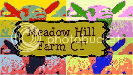
I've been working on the image... I plan on doing them as front label with a back label with ingredients.

grass-1-1-1-1-1-1-1.jpg


Suds-Surface-Honey-842689-1.jpg


skyandgrass-1-2.jpg


article-page-main-ehow-images-a07-g6-og-make-fake-soap-suds-800x800-1-1.jpg


grass-1-1-2.jpg
 
I like the first picture. It looks colourfull and modern.
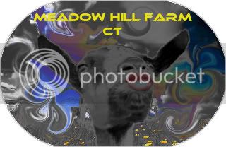
(I can not see the 3th picture for some reason)...
 
I agree with what has been said here.

Get rid of the lines, no need to use HTTP:// or www. for the web address.
I would also remove your blog, have a link on your website to the blog, remove your email, esty, and owner name. Instead use that space to say something about the soap, why people should buy it.

Also you are required to put the weight on the bottom 1/3, I think, of the PDP (Primary Display Panel) ie. the front.

I believe that is Comic Sans font you are using. That font was hot in the 80's but is dated now.

Don't forget to use TM
 
Back
Top